
Advanced Circumplex Visualization
Source:vignettes/advanced-visualization.Rmd
advanced-visualization.RmdLevel: Advanced. Read “Structure Tests and Ipsatization” first.
1. Overview
The ssm_plot_circle(), ssm_plot_curve(),
ssm_plot_contrast(), and ssm_plot_trajectory()
functions cover the most common circumplex figures. But they each
produce a finished plot with a fixed set of layers. Sometimes you want
more control. You may want to overlay individual respondents on a group
profile, or to zoom in on a band of amplitudes. Or you may want to
restyle the points, or to place several circumplex panels side by side.
vignette("introduction-to-ssm-analysis") defines the SSM
terms used here, such as amplitude and displacement.
To make that possible, circumplex exposes the building
blocks that the built-in plots are themselves made of. These are
ordinary ggplot2
components, so you compose them with + and combine them
freely with any other ggplot2 layers, scales, and
themes:
-
coord_circumplex()is the coordinate system. It maps thedisplacementaesthetic (degrees) onto the angle and theamplitudeaesthetic onto the radius. It also owns the amplitude-to-radius scaling for the whole plot. -
ggcircumplex()assembles the empty circular canvas: the coordinate system plus the amplitude rings, displacement spokes, and scale labels. -
geom_ssm_point()andgeom_ssm_arc()are the layers that place profile points and their confidence regions in the circle, taking amplitude and displacement directly as aesthetics. -
theme_circumplex()is the theme the canvas is drawn with. The rings and spokes are ordinary panel gridlines, so further theming restyles them. -
scale_x_circumplex()is a scale for the angle axis of linear circumplex plots. An example is the score-by-angle curve, with scale angle on a straight x-axis and score on the y-axis.
This vignette works through each of these and then combines them.
Section 2, “The circular canvas”, draws the empty canvas with
ggcircumplex(). Section 3, “The coordinate system”, builds
a figure from scratch with coord_circumplex(). Section 4,
“Placing SSM results in the circle”, adds profiles with
geom_ssm_point() and geom_ssm_arc(). Section
5, “Restyling the canvas”, themes it. Section 6, “Composing custom
layers”, adds respondents behind a group profile with
ssm_score(). Section 7, “The latent circumplex from a CPM
fit”, draws the angles a cpm_fit() estimated, measure
vectors, and the fitted correlation function. It closes with a joint
confidence ellipse from posterior draws. Section 8, “Trajectories across
occasions”, draws profiles estimated at several occasions. Section 9,
“The angle axis for linear plots”, labels a linear axis with
scale_x_circumplex(). Section 10, “Relationship to the
built-in plots”, says how the built-in plots use these parts. The
Wrap-up lists what the page covered and names the next page, and the
References list the sources cited.
2. The circular canvas
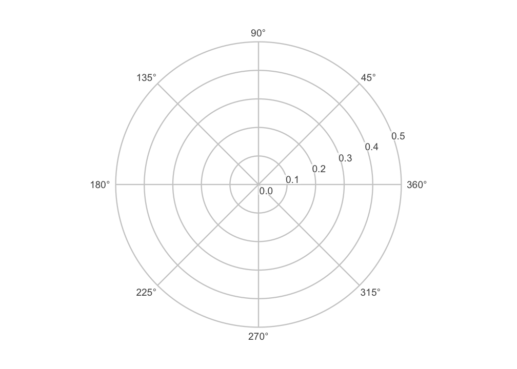
ggcircumplex() returns a ggplot2 object
containing just the circular backdrop, with no data drawn on it yet. By
default it uses octant scales (eight scales placed 45° apart), labeled
by their angular position in degrees:
You can label the scales however you like. Passing a character vector labels the spokes in the order of the angles:
ggcircumplex(octants(), labels = PANO())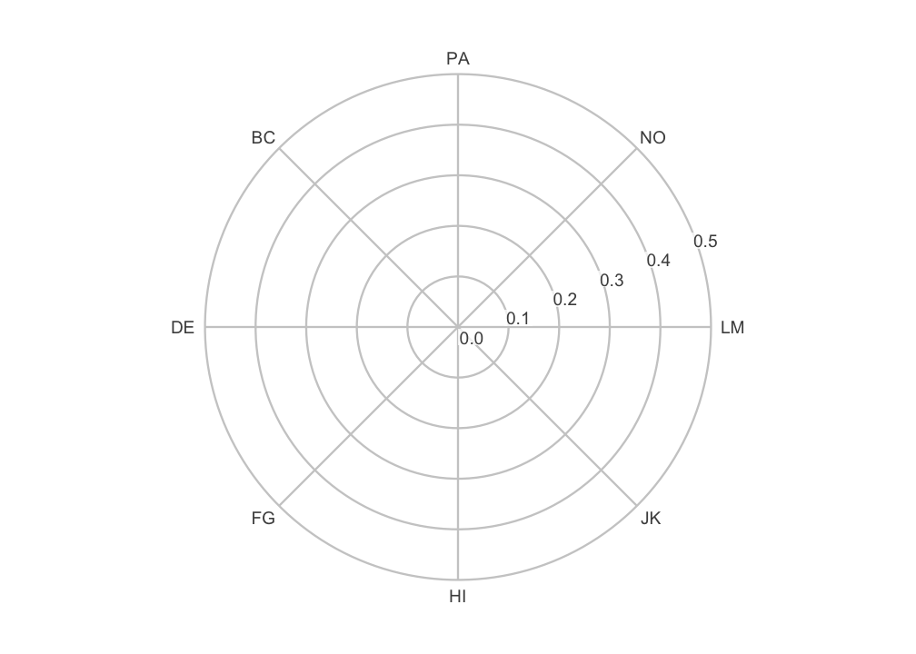
The labels need not be abbreviations. The octant scales also have full interpersonal names, which you can put on the spokes instead:
ggcircumplex(octants(), labels = csip$Scales$Label)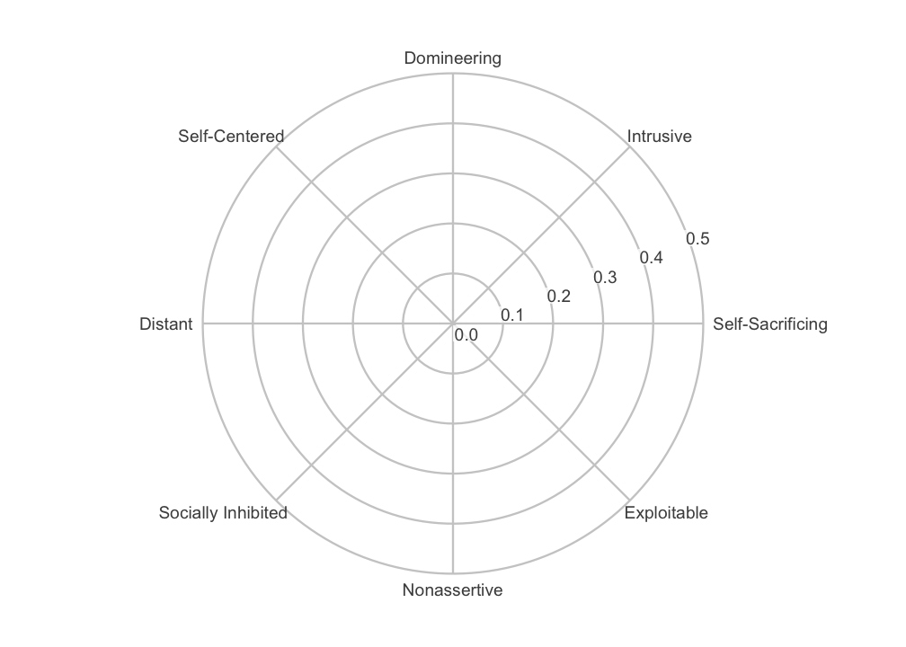
You may be working with one of the instruments bundled with the
package. If so, you can pass it directly with
ggcircumplex(instrument = csip). Its scale angles and
abbreviations are then taken from the instrument rather than typed by
hand.
Throughout, displacement runs counterclockwise from the right, and the 0/360 degree position is labeled 360.
3. The coordinate system
ggcircumplex() is a convenience wrapper. Underneath it,
the piece that makes a circumplex plot circular is
coord_circumplex(). You can add that to a bare
ggplot() yourself when you want to build a figure from
scratch. On top of the coordinate system you supply three things: an
x-scale carrying the spoke breaks and labels, a data layer, and the
theme.
results <- ssm_analyze(
  jz2017,
  scales = PANO(),
  measures = c("NARPD", "ASPD")
)
The table below shows five columns of results$results:
the profile label, the amplitude and displacement estimates, and the
amplitude interval. (The code that selects these columns is
omitted.)
#>   Label    a_est    d_est     a_lci     a_uci
#> 1 NARPD 0.189244 108.9667 0.1537900 0.2271848
#> 2  ASPD 0.226159 115.9267 0.1905403 0.2640428
ggplot(results$results) +
  coord_circumplex(amax = 0.3) +
  scale_x_continuous(breaks = octants(), labels = PANO()) +
  geom_ssm_point(aes(amplitude = a_est, displacement = d_est, fill = Label)) +
  theme_circumplex()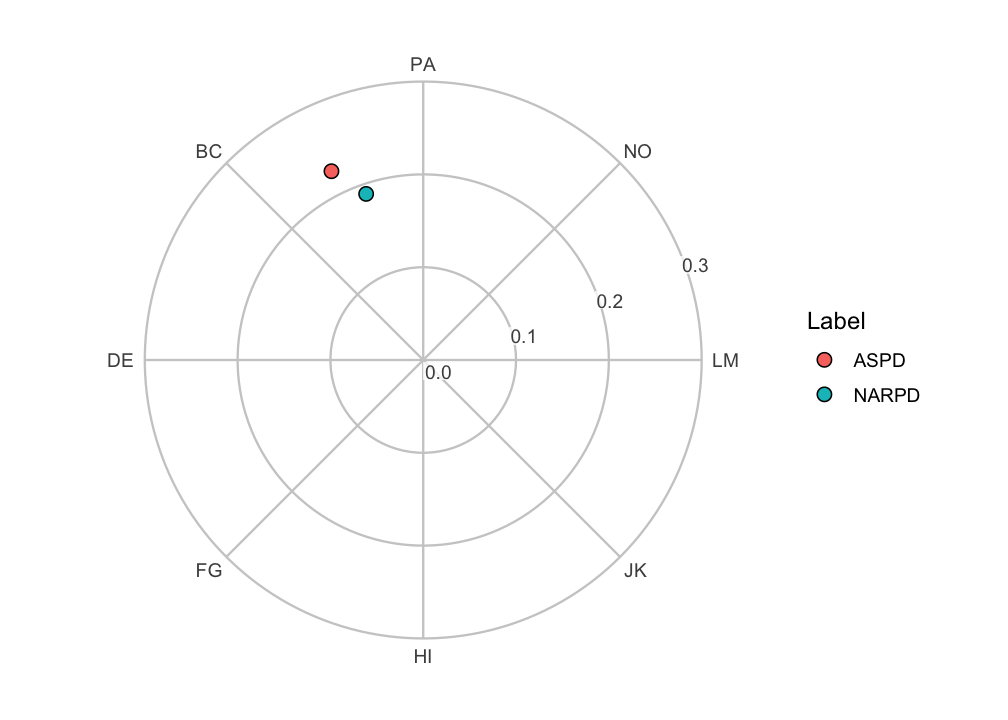
The scale_x_continuous() line is the one that tells the
coordinate system where the scale angles are. Without it, the spokes
would fall on ggplot2’s default breaks rather than on the
octants. Supplying those breaks and labels, along with the theme, is
what ggcircumplex() does on top of the coordinate system.
Build from the parts when you want to vary one of those pieces. Reach
for ggcircumplex() when you do not.
The coordinate system owns the amplitude-to-radius mapping. So
amax is set exactly once per plot, and the canvas and the
data layers cannot disagree about what a given radius means. (Earlier
versions of the package took an amax argument on each
layer. Those arguments are now deprecated and ignored, with a one-time
note.) Leaving amax = NULL trains it from the data, as
ssm_plot_circle() does.
Moving the center
By default, the center of the circle is amplitude 0. So radial
distance is proportional to amplitude, and the origin means “no
differentiation among the scales.” The center argument
moves that inner limit. This is useful when every profile sits in a
narrow band of amplitudes and the interesting variation is squeezed
against the rim:
ggplot(results$results) +
  coord_circumplex(amax = 0.28, center = 0.15) +
  scale_x_continuous(breaks = octants(), labels = PANO()) +
  geom_ssm_point(aes(amplitude = a_est, displacement = d_est, fill = Label)) +
  theme_circumplex()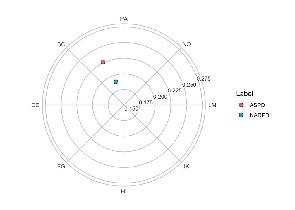
This is a zoom, and it changes how the figure should be read. With a nonzero center, radial distance is no longer proportional to amplitude. The origin no longer represents zero amplitude. So differences in radius are exaggerated relative to the default view. The amplitude ring labels still report the true amplitudes, and they are what the reader should be directed to. Use a nonzero center to resolve closely spaced profiles, and say so in the caption.
Moving the amplitude axis
The amplitude (radial) axis and its tick labels are placed
automatically in the widest gap between the displacement spokes. So they
never collide with a spoke label. ssm_plot_circle() and
plot() for a CPM fit go one step further and use the widest
gap that holds no plotted point. You can override the placement with
r_axis_angle, given as a displacement in degrees:
ggplot(results$results) +
  coord_circumplex(amax = 0.3, r_axis_angle = 67.5) +
  scale_x_continuous(breaks = octants(), labels = PANO()) +
  geom_ssm_point(aes(amplitude = a_est, displacement = d_est, fill = Label)) +
  theme_circumplex()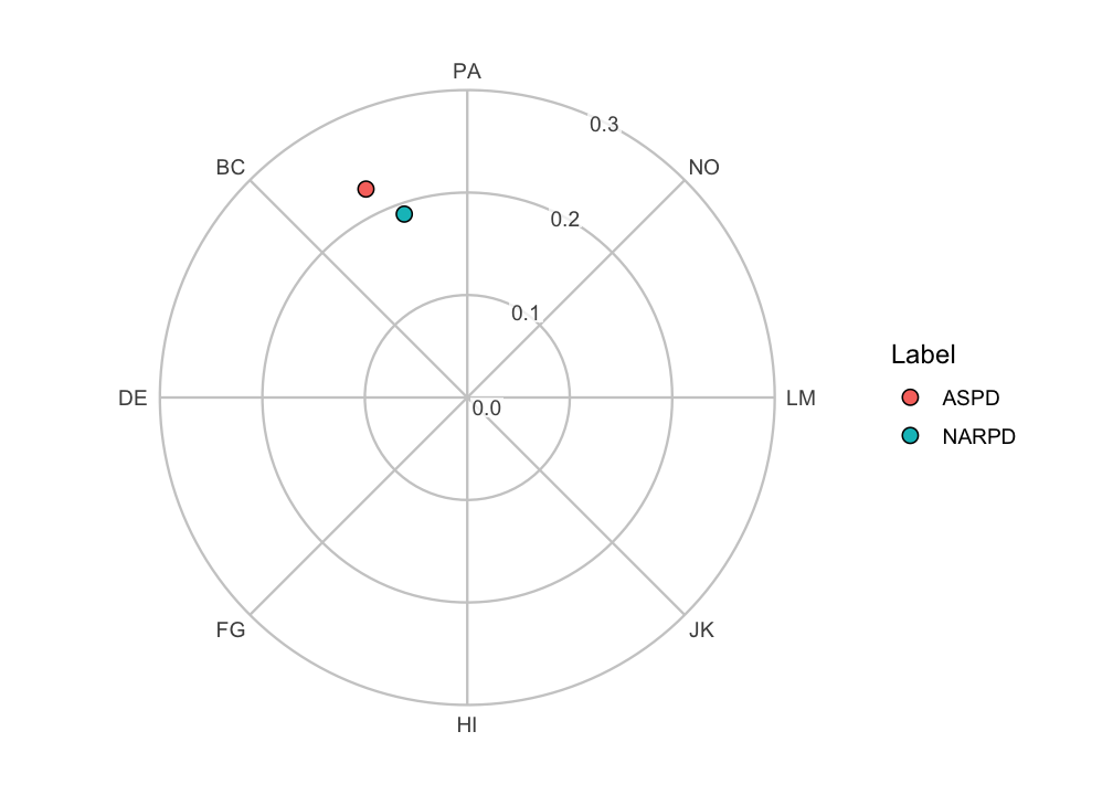
Note that these examples build the canvas from its parts: the
coordinate system, an x-scale carrying the spoke breaks and labels, and
the theme. They do not add a second coordinate system on top of
ggcircumplex(). If they did, ggplot2 would
replace the existing coordinate system and print a message.
4. Placing SSM results in the circle
Let’s draw the two-measure profile from above on a labeled canvas
ourselves, rather than calling ssm_plot_circle().
geom_ssm_point() places a point for each profile at its
amplitude (a_est) and displacement (d_est).
geom_ssm_arc() draws a wedge for each profile. The wedge
spans the profile’s amplitude confidence interval radially and its
displacement confidence interval angularly. Both take the SSM parameters
directly as aesthetics and handle the conversion into circular
coordinates internally. That includes wrap-around when a displacement
interval crosses the 0/360 degree boundary.
ggcircumplex(octants(), labels = PANO(), amax = 0.3) +
  geom_ssm_arc(
    data = results$results,
    mapping = aes(
      amplitude_min = a_lci, amplitude_max = a_uci,
      displacement_min = d_lci, displacement_max = d_uci,
      fill = Label
    ),
    alpha = 0.4, color = NA
  ) +
  geom_ssm_point(
    data = results$results,
    mapping = aes(amplitude = a_est, displacement = d_est, fill = Label)
  )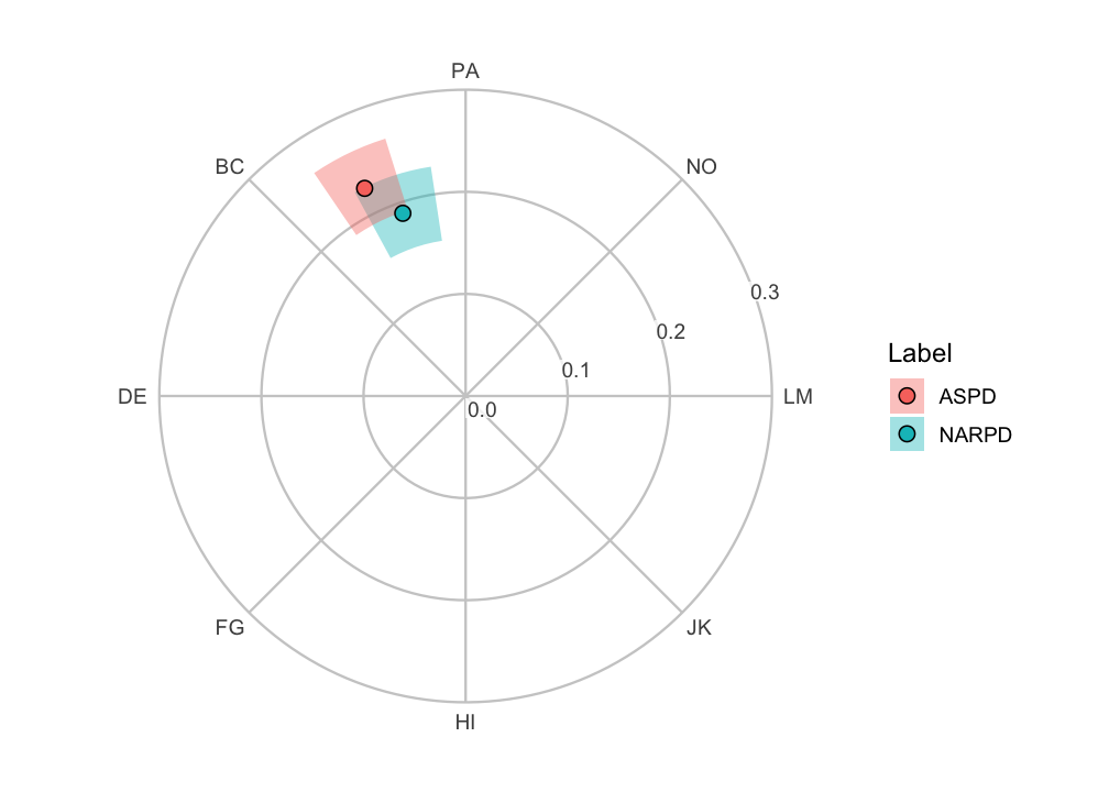
Each arc displays two separate confidence intervals for one profile at once. Its radial extent is the amplitude interval, and its angular extent is the displacement interval. It is a convenient way to show both intervals together. It is not a single joint confidence region with its own coverage level, and it is not a hypothesis test.
The angular extent in particular is a range of plausible
directions. Zero degrees is an arbitrary reference direction
rather than a null value. So, unlike a confidence interval for a linear
parameter (such as elevation), the angular extent should not be read as
a significance test. Displacement is only worth interpreting at all when
the amplitude interval is clearly above zero and the model fits
reasonably well. See the “Introduction to SSM Analysis” vignette and
?ssm_analyze.
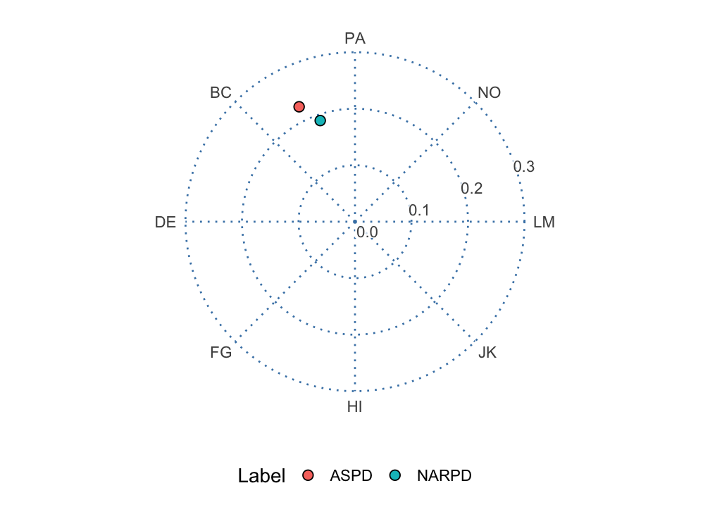
5. Restyling the canvas
theme_circumplex() is the theme
ggcircumplex() applies. Because the rings, spokes, and
labels are themed panel furniture rather than drawn geometry, any
further theming reaches them. Adjust the base font size through the
theme, and restyle the gridlines with an ordinary theme()
call:
ggcircumplex(octants(), labels = PANO(), amax = 0.3) +
  geom_ssm_point(
    data = results$results,
    mapping = aes(amplitude = a_est, displacement = d_est, fill = Label)
  ) +
  theme_circumplex(base_size = 14) +
  theme(
    panel.grid.major = element_line(color = "steelblue", linetype = "dotted"),
    legend.position = "bottom"
  )
6. Composing custom layers
Because the canvas and geoms are ordinary ggplot2
objects, you can add anything else to them. A common request is to show
where individual respondents fall relative to a summary. We can compute
each person’s own amplitude and displacement with
ssm_score() and draw them as a faint cloud behind a
group-level point.
# Per-person SSM parameters for a subset of the sample
people <- ssm_score(
  jz2017[1:100, ],
  scales = PANO(),
  append = FALSE
)
A respondent whose scores are flat has no displacement.
ssm_score() returns NA for that person, with a
warning. So we drop the rows of people whose
Disp is NA and keep only the well-defined
profiles. (That code is omitted.)
# Group-level profile for the same subset
group <- ssm_analyze(jz2017[1:100, ], scales = PANO())

# The group amplitude is shorter than a typical individual amplitude
c(group = group$results$a_est, median_individual = median(people$Ampl))
#>             group median_individual
#>         0.3651863         0.5189425

ggcircumplex(octants(), labels = PANO(), amax = 1.75) +
  geom_ssm_point(
    data = people,
    mapping = aes(amplitude = Ampl, displacement = Disp),
    fill = "grey70", size = 1.5, alpha = 0.6
  ) +
  geom_ssm_point(
    data = group$results,
    mapping = aes(amplitude = a_est, displacement = d_est),
    fill = "#0072B2", size = 4
  )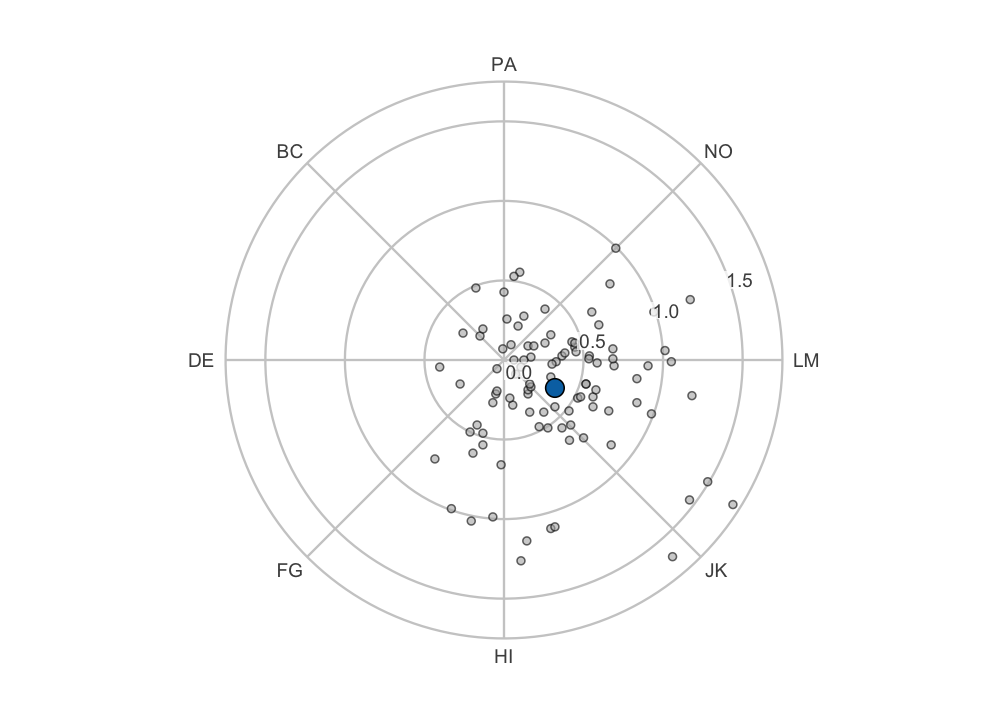
The individual points spread widely around the circle, while the
group summary sits close to the origin. That contrast is not an
artifact. The group profile is the SSM of the mean scale
scores. So its position is the average of the individual positions in
(x, y), the Cartesian coordinates of each profile’s point in the circle.
Averaging vectors that point in different directions yields an average
vector shorter than the typical individual vector. The two amplitudes
printed above show this. A group amplitude smaller than a typical
person’s therefore indicates disagreement about direction among
the respondents, not that each person’s profile is flat. None of the
built-in functions produce this picture directly. Any other
ggplot2 layer (text annotations, additional geoms,
faceting) can be added the same way.
7. The latent circumplex from a CPM fit
The canvases above place every scale at its theoretical angle. Those
angles are an assumption. cpm_fit() estimates them instead.
It fits Browne’s (1992) circular process model, which places each scale
at an angle on a latent circle. The model describes the correlation
between two scales as a function of their angular separation. The
“Evaluating Circumplex Structure” vignette covers the model and its fit
indices. This section draws what the fit estimated, with the layers the
earlier sections used. Nothing here needs a new function.
The call below asks for analytic confidence intervals, but the
figures draw only the point estimates. On this sample the fit sits at a
boundary: the communality index of NO reached its upper limit, so
print(cpm) notes a Heywood-type solution. The analytic
intervals all come back NA. The Hessian is also
ill-conditioned, so the call warns, and its condition number and some
later digits differ across BLAS libraries. The “CPM Fits at a Boundary”
vignette reads both the note and the warning in full.
cpm <- cpm_fit(jz2017, scales = PANO(), angles = octants(), ci_method = "analytic")
#> Warning: CPM Hessian is ill-conditioned (condition number 1.83e+14): angles
#> may be clustered or parameters weakly determined.
cpm$results[, c("Scale", "Angle_theory", "Angle", "Zeta")]
#>   Scale Angle_theory     Angle      Zeta
#> 1    PA           90  90.00000 0.7672831
#> 2    BC          135 125.07437 0.9313971
#> 3    DE          180 170.35282 0.7798895
#> 4    FG          225 195.42521 0.8609945
#> 5    HI          270 250.72074 0.9562548
#> 6    JK          315 269.49093 0.9421295
#> 7    LM          360 294.23003 0.8059460
#> 8    NO           45  11.30488 1.0000000
Angle_theory is the angle each scale was given.
Angle is the angle the model estimated for it. The first
scale, PA, is not estimated: it is fixed at its theoretical angle to set
the rotation. Every other angle is read relative to it. Where the two
differ, the instrument’s scales do not sit where the theory placed them,
relative to PA, in this sample. Here every scale but PA sits clockwise
of its theoretical angle. BC and DE sit 10 degrees clockwise and the
rest 19 to 66 degrees clockwise. NO’s estimated angle of 11 degrees is
near the theoretical position of LM. The three circle figures that
follow draw the estimated angles alone. The ellipse figure at the end of
the section returns to the theoretical octants() canvas.
Zeta is each scale’s communality index, which the
discussion of the correlation-function figure below uses.
The circle figures in this section follow Nagy, Etzel and Lüdtke
(2019). Their Figure 6, and the two extension panels of their Figure 3,
place the scales at their estimated angles. The canvas is a plain circle
with a labelled crosshair. The canvas is ggcircumplex()
with two arguments. grid = "cartesian" draws that circle
and crosshair and no rings or spokes. angle_labels = TRUE
writes each scale’s angle into its rim label.
Estimated angles as ticks on the rim
The first figure is the canvas alone. Its angles are the fit’s
Angle column, so each rim tick sits at a scale’s estimated
angle. Each label carries the scale’s name and its estimated angle
rounded to the nearest degree. The crosshair marks the Cartesian
coordinates of the score metric. The rim’s amplitude is 0.3, the value
the measure figures below need.
canvas <- ggcircumplex(
  angles = cpm$results$Angle, labels = cpm$results$Scale,
  amax = 0.3, grid = "cartesian", angle_labels = TRUE
)
canvas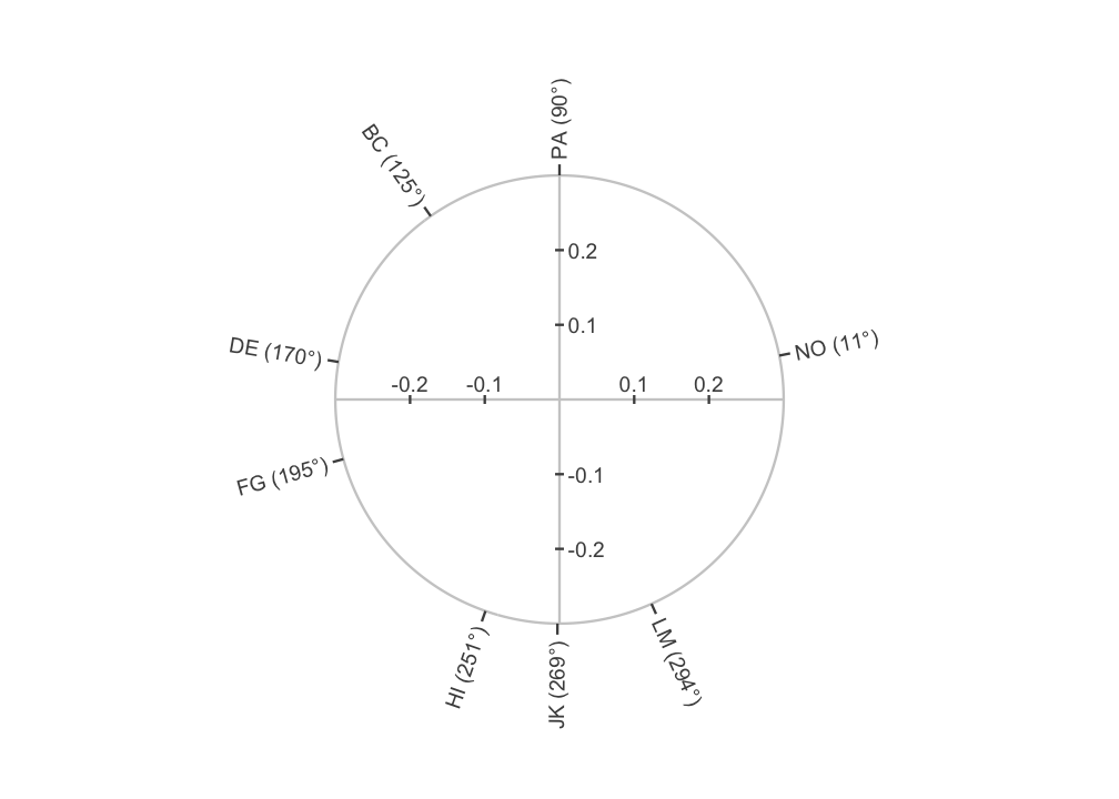
The ticks and their labels sit at the angles cpm_fit()
estimated, and the theoretical angles appear only in the table above the
figure. PA sits at 90 degrees by construction, because its angle was
fixed. The other scales sit where the model placed them relative to PA.
The tick for NO sits 11 degrees counterclockwise of LM’s theoretical
position. DE and FG are 25 degrees apart where the theory puts them 45
apart. The crosshair’s labels are Cartesian coordinates and carry no
meaning in this figure. They matter once a measure is placed inside the
circle.
Measure points on the same rim
Nagy, Etzel and Lüdtke (2019, Figure 6) draw each external measure as
a labelled point inside a circle whose rim carries the estimated angles.
Their Figure 3 joins the point to the origin by a straight line. The
point’s direction from the origin is the measure’s displacement and its
distance from the origin is the measure’s amplitude.
ssm_analyze() supplies both. The second figure adds five
personality-disorder measures from jz2017 in that form, on
the canvas above. Each measure is one point at a_est and
d_est, one two-row path from amplitude 0 to that point, and
one text label. The hjust and vjust values
place each label beside its point, away from the other labels. They are
chosen by hand and keyed by measure name.
ssm <- ssm_analyze(
  jz2017,
  scales = PANO(),
  measures = c("NARPD", "ASPD", "HISPD", "AVPD", "SCZPD")
)
measures <- ssm$results
hjust <- c(NARPD = -0.15, ASPD = 1.1, HISPD = -0.15, AVPD = 0.5, SCZPD = 1.15)
vjust <- c(NARPD = 1.4, ASPD = -0.3, HISPD = 0.5, AVPD = 1.6, SCZPD = 0.5)
measures$hjust <- hjust[measures$Label]
measures$vjust <- vjust[measures$Label]
spokes <- data.frame(
  Label = rep(measures$Label, each = 2),
  amplitude = c(rbind(0, measures$a_est)),
  displacement = rep(measures$d_est, each = 2)
)

canvas +
  geom_ssm_path(
    data = spokes,
    mapping = aes(
      amplitude = amplitude, displacement = displacement, group = Label
    )
  ) +
  geom_ssm_point(
    data = measures,
    mapping = aes(amplitude = a_est, displacement = d_est)
  ) +
  geom_text(
    data = measures,
    mapping = aes(
      x = d_est, y = a_est, label = Label, hjust = hjust, vjust = vjust
    )
  )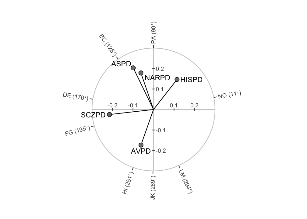
The rim and the points do not share a model. The rim ticks are the
angles the circular process model estimated. The points are SSM
displacements and amplitudes, and the SSM was computed with the
theoretical angles, not the estimated ones. A point that lies in the
direction of a tick does not mean that the measure loads on that scale’s
latent position. Likewise, a measure’s distance from the origin is its
SSM amplitude computed on the theoretical angles and not a loading on
the latent circle. The amplitude is the cosine curve’s amplitude in the
measure’s correlations with the eight scales, in the correlation metric
that ssm_analyze() reports. To place a measure on the
estimated circle itself, you would fit it inside the model, which
cpm_fit() does not do. geom_text() places a
label at x = d_est and y = a_est because
coord_circumplex() reads x as displacement and
y as amplitude. That is how every circumplex layer hands
its positions to the coordinate system.
One measure with its amplitude and displacement
Nagy, Etzel and Lüdtke (2019, Figure 3) annotate a single measure.
They draw the point, its line from the origin, and an arc that sweeps
counterclockwise from 0 degrees to the measure’s displacement. The two
values are written beside them. The third figure draws SCZPD that way.
The arc is a path at one fixed amplitude whose displacement runs from 0
to d_est. It shows how the displacement is measured,
counterclockwise from the positive horizontal axis. The two
annotate() calls write d_est rounded to the
nearest degree and a_est rounded to two decimals.
one <- measures[measures$Label == "SCZPD", ]
arc <- data.frame(
  amplitude = 0.08,
  displacement = seq(0, one$d_est, length.out = 100)
)

canvas +
  geom_ssm_path(
    data = spokes[spokes$Label == "SCZPD", ],
    mapping = aes(amplitude = amplitude, displacement = displacement)
  ) +
  geom_ssm_path(
    data = arc,
    mapping = aes(amplitude = amplitude, displacement = displacement)
  ) +
  geom_ssm_point(
    data = one,
    mapping = aes(amplitude = a_est, displacement = d_est)
  ) +
  geom_text(
    data = one,
    mapping = aes(x = d_est, y = a_est, label = Label),
    hjust = 1.2
  ) +
  annotate(
    "text", x = 60, y = 0.13, hjust = 0,
    label = paste0("d = ", round(one$d_est), "°")
  ) +
  annotate(
    "text", x = one$d_est, y = one$a_est / 2,
    label = paste0("a = ", sprintf("%.2f", one$a_est)), vjust = 1.5
  )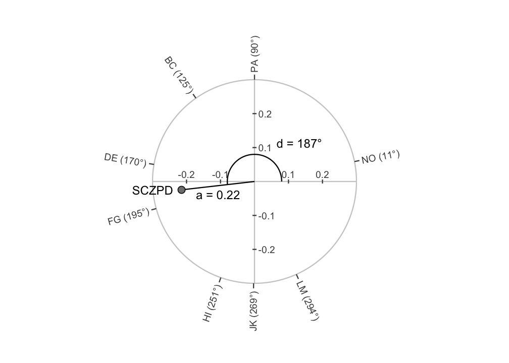
The displacement label starts above the arc at 60 degrees and runs to
the right, clear of the vertical axis and its labels. The amplitude
label sits at half the amplitude, below the line. SCZPD’s displacement
is past 180 degrees, so the arc passes through the upper half of the
circle and ends just below the negative horizontal axis. The values are
the d_est and a_est columns of
ssm$results, not values read off the figure.
The fitted correlation function
The fourth figure is linear. The fit’s corfun element is
the estimated correlation function. It takes the angular separation
between two scales, in degrees, and returns the correlation between
their common parts. The figure draws it over separations from 0 to 180
degrees and places every pair of scales on the same axes. A pair’s
separation is the absolute angular distance between its two estimated
angles. The modular expression below computes it so that a pair
straddling 0/360 gets the short way round. The filled points are the
observed correlations from matrices$R. The hollow points
are the correlations the model reproduces, from
matrices$Phat.
curve <- data.frame(separation = 0:180)
curve$correlation <- cpm$corfun(curve$separation)

pair_idx <- which(upper.tri(cpm$matrices$R), arr.ind = TRUE)
a <- cpm$results$Angle[pair_idx[, 1]]
b <- cpm$results$Angle[pair_idx[, 2]]
observed <- data.frame(
  separation = abs(((a - b + 180) %% 360) - 180),
  observed = cpm$matrices$R[pair_idx],
  implied = cpm$matrices$Phat[pair_idx]
)

ggplot(observed, aes(x = separation)) +
  geom_line(data = curve, aes(y = correlation)) +
  geom_point(aes(y = observed, shape = "Observed"), size = 2) +
  geom_point(aes(y = implied, shape = "Reproduced"), size = 2) +
  scale_shape_manual(values = c(Observed = 16, Reproduced = 1), name = NULL) +
  scale_x_continuous(breaks = seq(0, 180, by = 45)) +
  labs(x = "Angular separation (degrees)", y = "Correlation") +
  theme_bw()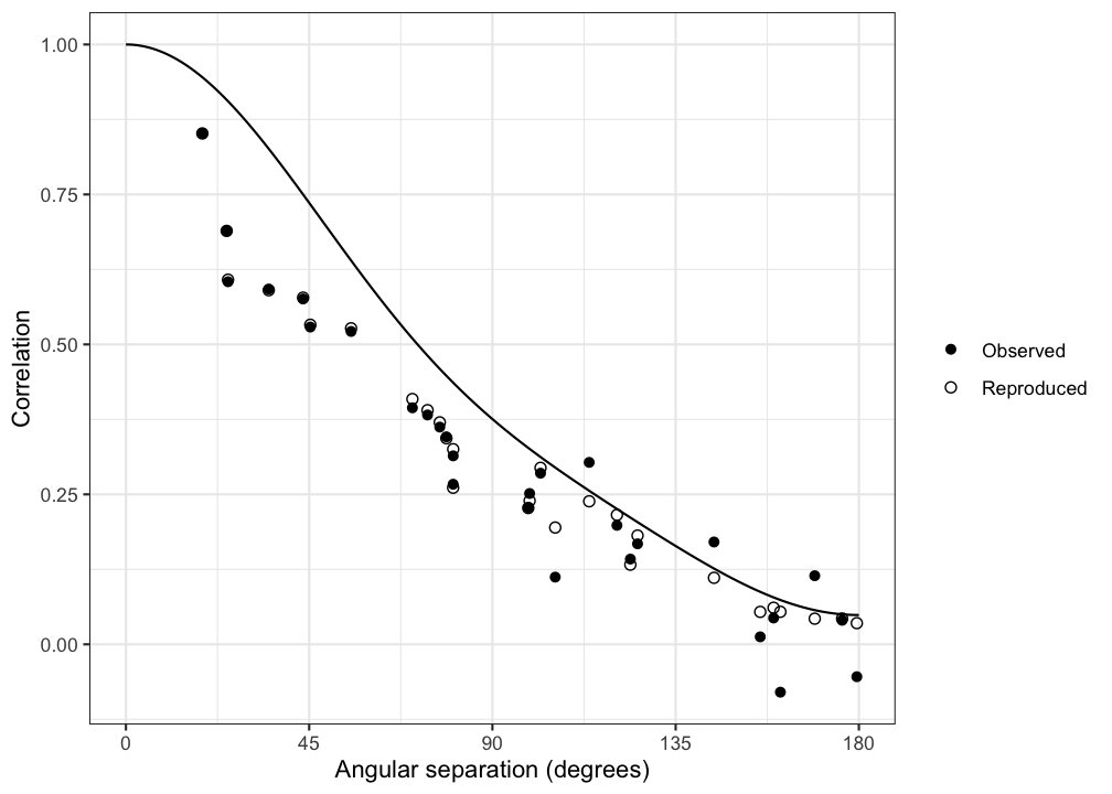
In this figure the points are observed correlations and the line is
the fitted correlation function. The hollow points are the correlations
the model reproduces, not observations. The filled points sit below the
line at most separations, and part of that gap is attenuation, not
misfit. The line is the correlation between two scales’ common parts.
Under the default unit scaling, the model reproduces a pair’s
correlation as the line’s value at the pair’s separation multiplied by
both scales’ communality indices. Those indices are the
Zeta column. A scale with a communality index below one
pulls every point it belongs to below the line by that factor. The
hollow points show where each pair lands after that attenuation. The
filled point minus the hollow point is the pair’s residual, the entry of
matrices$residuals. Read the line for the shape of the
latent circumplex and the residuals for the fit.
A joint confidence ellipse from posterior draws
The wedge that geom_ssm_arc() draws is built from two
intervals, one on amplitude and one on displacement. A profile’s
uncertainty can also be shown as a joint region on the Cartesian
coordinates under a normal approximation to the draws.
geom_ssm_ellipse() draws that region as an ellipse. It
takes a centre (x0, y0) and the three elements of a 2 by 2
covariance matrix as aesthetics. ssm_ellipse_data()
computes those five columns from an ssm_draws() object, so
the layer needs a result that retains draws. The draws below are the
posterior draws that the “Bayesian SSM Analysis” vignette analyses. They
ship with the package in bayesian_ssm_draws.rds, generated
once by the seeded script data-raw/bayesian_ssm_draws.R,
and that vignette states the model they come from.
draws <- readRDS("bayesian_ssm_draws.rds")
post <- ssm_draws(draws, type = "parameters")
ellipse <- ssm_ellipse_data(post)
ellipse
#>          x0         y0        var_x        var_y        cov_xy
#> 1 0.3523431 -0.3192543 0.0005952007 0.0005500366 -6.093168e-06
Nagy, Etzel and Lüdtke (2019, Figure 4 and Appendices B and C) read
four lines off such an ellipse. Two are the tangents from the origin to
the ellipse. Their angles bound the arc of directions the ellipse spans,
read counterclockwise from the first tangent to the second. Two join the
origin to the nearest and farthest points of the ellipse’s boundary.
Their lengths are the smallest and largest amplitudes of any point in
the ellipse. The function below computes all four from the one-row data
frame above and the ellipse’s confidence level. It works from the
covariance form that geom_ssm_ellipse() draws and solves
the two problems numerically, rather than transcribing the appendices’
quartic and slope equations. A direction from the origin is tangent to
the ellipse when the line along it meets the ellipse at exactly one
point. That makes the quadratic for where the line meets the ellipse
have a double root. Setting its discriminant to zero gives a quadratic
in the direction’s slope, whose two roots are the two tangent
directions. The two distances are the extremes of the boundary radius
over the ellipse’s parametric angle, found on a fine grid and refined
with optimize(). When the origin lies inside the ellipse
there are no tangents, so those two angles are NA. The
nearest distance is then the smallest boundary radius.
ellipse_lines <- function(ellipse, level = 0.95) {
  centre <- c(ellipse$x0, ellipse$y0)
  S <- matrix(
    c(ellipse$var_x, ellipse$cov_xy, ellipse$cov_xy, ellipse$var_y), 2, 2
  )
  r2 <- qchisq(level, df = 2)
  A <- solve(S)
  # A direction w is tangent when (w'Ac)^2 = (w'Aw)(c'Ac - r2), so w'Mw = 0.
  # The origin is outside the ellipse when c'Ac exceeds r2.
  outside <- drop(t(centre) %*% A %*% centre) - r2
  tangents <- c(NA_real_, NA_real_)
  if (outside > 0) {
    Ac <- drop(A %*% centre)
    M <- tcrossprod(Ac) - outside * A
    # The zero directions of w'Mw solve a quadratic in the slope. Use the
    # slope or its reciprocal, whichever gives the larger leading coefficient.
    # Both roots are real whenever the origin is outside (det(M) < 0), so
    # Re() drops only a zero imaginary part.
    if (abs(M[2, 2]) >= abs(M[1, 1])) {
      w <- rbind(1, Re(polyroot(c(M[1, 1], 2 * M[1, 2], M[2, 2]))))
    } else {
      w <- rbind(Re(polyroot(c(M[2, 2], 2 * M[1, 2], M[1, 1]))), 1)
    }
    # Point each direction towards the ellipse, then order the pair so that
    # the counterclockwise arc from the first to the second holds the centre.
    w <- sweep(w, 2, sign(colSums(w * Ac)), `*`)
    tangents <- (atan2(w[2, ], w[1, ]) * 180 / pi) %% 360
    if ((tangents[2] - tangents[1]) %% 360 > 180) tangents <- rev(tangents)
  }
  # The boundary radius as a function of the parametric angle.
  L <- t(chol(S)) * sqrt(r2)
  boundary <- function(theta) centre + L %*% rbind(cos(theta), sin(theta))
  radius <- function(theta) sqrt(colSums(boundary(theta)^2))
  grid <- seq(0, 2 * pi, length.out = 3601)[-3601]
  step <- grid[2] - grid[1]
  refine <- function(i, maximum) {
    optimize(radius, grid[i] + c(-step, step), maximum = maximum, tol = 1e-12)
  }
  nearest <- refine(which.min(radius(grid)), maximum = FALSE)
  farthest <- refine(which.max(radius(grid)), maximum = TRUE)
  angle_of <- function(theta) {
    v <- boundary(theta)
    (atan2(v[2], v[1]) * 180 / pi) %% 360
  }
  data.frame(
    line = c("tangent_1", "tangent_2", "nearest", "farthest"),
    displacement = c(
      tangents, angle_of(nearest$minimum), angle_of(farthest$maximum)
    ),
    amplitude = c(NA, NA, nearest$objective, farthest$objective)
  )
}
level <- 0.95
four_lines <- ellipse_lines(ellipse, level = level)
four_lines
#>        line displacement amplitude
#> 1 tangent_1     310.7611        NA
#> 2 tangent_2     324.8137        NA
#> 3   nearest     317.5519 0.4164769
#> 4  farthest     318.0873 0.5344676
The displacement column holds the two tangent angles and
the directions of the nearest and farthest boundary points. The
amplitude column holds the two distances. The tangents are
listed so that the counterclockwise arc from tangent_1 to
tangent_2 holds the ellipse, which matters for an ellipse
that straddles 0/360 degrees.
The figure draws the wedge, the ellipse, the four lines and the point
estimate for the same profile on one canvas. The wedge and the point
come from post$results, as in Section 4. The ellipse comes
from the one-row data frame above, drawn at the same level
the four lines were computed at. The two tangent lines are dashed and
run from the origin to the rim. The two distance lines are dotted and
run from the origin to the nearest and farthest boundary points.
amax <- 0.6
tangents <- data.frame(
  line = rep(four_lines$line[1:2], each = 2),
  amplitude = rep(c(0, amax), times = 2),
  displacement = rep(four_lines$displacement[1:2], each = 2)
)
distances <- data.frame(
  line = rep(four_lines$line[3:4], each = 2),
  amplitude = c(rbind(0, four_lines$amplitude[3:4])),
  displacement = rep(four_lines$displacement[3:4], each = 2)
)

ggcircumplex(
  octants(), labels = PANO(), amax = amax,
  grid = "cartesian", angle_labels = TRUE
) +
  geom_ssm_arc(
    data = post$results,
    mapping = aes(
      amplitude_min = a_lci, amplitude_max = a_uci,
      displacement_min = d_lci, displacement_max = d_uci
    ),
    alpha = 0.15
  ) +
  geom_ssm_path(
    data = tangents,
    mapping = aes(
      amplitude = amplitude, displacement = displacement, group = line
    ),
    linetype = "dashed"
  ) +
  geom_ssm_path(
    data = distances,
    mapping = aes(
      amplitude = amplitude, displacement = displacement, group = line
    ),
    linetype = "dotted", color = "gray40"
  ) +
  geom_ssm_ellipse(
    data = ellipse,
    mapping = aes(
      x0 = x0, y0 = y0, var_x = var_x, var_y = var_y, cov_xy = cov_xy
    ),
    level = level
  ) +
  geom_ssm_point(
    data = post$results,
    mapping = aes(amplitude = a_est, displacement = d_est),
    size = 1.5
  ) +
  geom_text(
    data = post$results,
    mapping = aes(x = d_est, y = a_est, label = "Mean profile"),
    hjust = -0.3
  )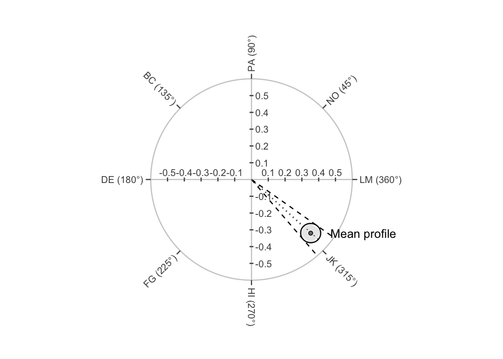
The label names what the draws describe: the mean octant profile of the subsample the “Bayesian SSM Analysis” vignette fits. The ellipse is small on this canvas because the posterior is tight, so the point is drawn small to keep the outline visible. The wedge is drawn light so that the ellipse and the four lines read over it. The tangent lines bound the directions the ellipse spans under the normal approximation and are not the displacement interval the wedge draws. The wedge’s displacement interval is a circular-quantile interval of the draws. The tangent angles come from the ellipse alone, so the two pairs of angles differ. Here the tangents at 311 and 325 degrees sit outside the wedge’s interval from 312 to 323 degrees.
Here the ellipse is centred on the posterior medians of
x and y, not on the plotted point, and its
covariance comes from the draws. The medians are the values
ssm_draws() reports as x_est and
y_est. The plotted point is a_est at
d_est: the median amplitude at the circular mean
displacement. Those are marginal summaries, so the point is not the
polar form of the medians of x and y. The
chunk below computes the distance between the centre and the point in
the score metric. Here it is too small to see.
point <- post$results$a_est *
  c(cos(post$results$d_est * pi / 180), sin(post$results$d_est * pi / 180))
sqrt(sum((c(ellipse$x0, ellipse$y0) - point)^2))
#> [1] 0.0004661232
The covariance is the sample covariance of the draws of
x and y. The wedge and the ellipse are two
different summaries of the same draws. The ellipse is a joint region on
the Cartesian coordinates under a normal approximation to the draws. By
contrast, the wedge is the pair of marginal intervals on amplitude and
displacement, a percentile interval on amplitude and a circular-quantile
interval on displacement. The wedge draws those two intervals together
as one region. Neither interval depends on a normal approximation. The
two regions answer different questions, so the two need not coincide. In
this figure the ellipse reaches farther than the wedge along both the
amplitude axis and the displacement axis. The wedge’s four corners still
fall outside the ellipse.
Read the ellipse against the origin with care. An ellipse at
confidence level 1 − α that excludes the origin rejects zero amplitude
in a Wald test at significance level α. That holds only under the normal
approximation. A Wald test compares an estimate with its standard error,
here the pair (x, y) with its covariance. The ellipse above
is drawn at confidence level 0.95. It is the set of (x, y)
values the test does not reject at significance level 0.05. Its
covariance is a posterior covariance, so that reading also treats the
posterior under the normal approximation as the sampling distribution of
the estimate. The wedge makes no such test. A displacement interval that
excludes some angle is not a significance test of that angle. An
amplitude interval above zero is a statement about amplitude alone.
8. Trajectories across occasions
Sometimes the same people are measured on the same scales at two or
more occasions. Then ssm_analyze_long() (for long data) or
ssm_analyze(occasions = ) (for wide data) estimates one SSM
profile per occasion. It resamples persons so that within-person
dependence across occasions is respected.
ssm_plot_trajectory() then draws each SSM parameter against
time.
The package ships a small simulated three-wave data set,
simulated_occasions. Its group profile rotates
counterclockwise across the 0/360 degree boundary, which is the case
worth seeing drawn. The data frame has one row per person per wave. Its
columns are an id, a wave factor with levels
T1, T2 and T3, and the eight
PANO() scales. ?simulated_occasions states how
it was simulated. We load it and estimate one profile per wave with
ssm_analyze_long():
data("simulated_occasions")
results_long <- ssm_analyze_long(
  simulated_occasions,
  scales = PANO(),
  id = "id",
  occasion = "wave"
)
The table below shows five columns of
results_long$results: the occasion, the amplitude and
displacement estimates, and the displacement interval. (The code that
selects these columns is omitted.)
#>   Occasion     a_est     d_est     d_lci     d_uci
#> 1       T1 0.5707423 332.41252 329.28366 335.57815
#> 2       T2 0.5968632 354.84909 351.80498 357.66599
#> 3       T3 0.5959438  21.05834  17.83082  24.00907
ssm_plot_trajectory(results_long, drop_xy = TRUE)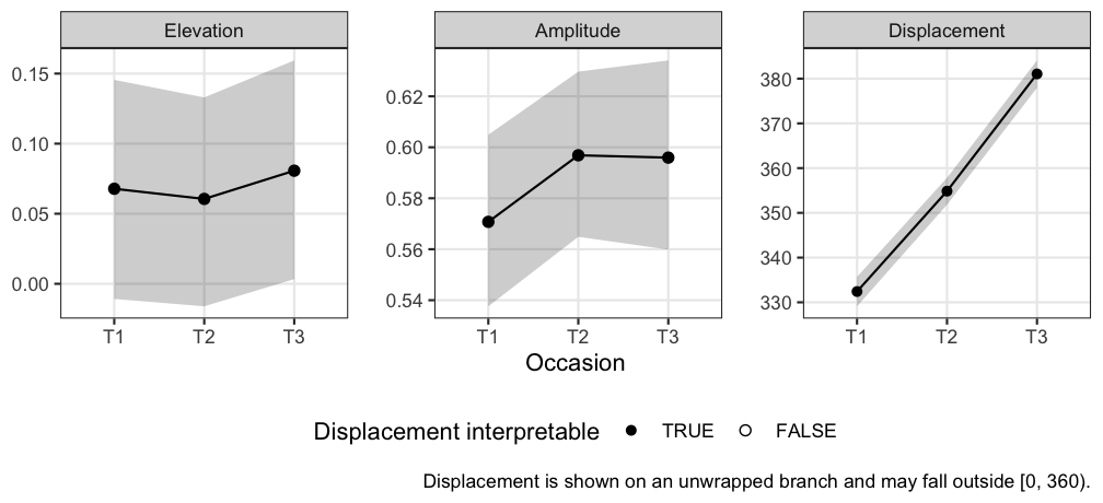
Two things about the displacement panel are worth reading carefully. First, it is drawn on an unwrapped branch, which lets angles go past 360 (or below 0) so that the line stays continuous. The profile crosses the 0/360 boundary between the second and third wave. Rather than jumping a full turn, the panel continues past 360, so values outside [0, 360) are expected there.
Second, the occasion order comes from the data rather than from the
plot. For a character occasion column, it is first-appearance order. For
a factor, it is the factor’s level order. Note that
factor() sorts its levels alphabetically by default, which
would place T10 before T2. So if your occasion
column is a factor, set its levels in temporal order.
The unwrap carries an assumption that no data can check: that the profile rotates less than a half-turn between consecutive occasions. Waves that are far apart in time, or a series with a gap, could rotate further than that. Such a rotation would be drawn as the shorter rotation regardless. So read widely spaced occasions with that in mind.
A time point’s amplitude interval can be too close to zero for its displacement to be interpretable. Such a time point is drawn as a hollow point, and the line segments on either side of it are drawn dashed. A dashed segment touches a time point whose displacement is not interpretable, so the direction of change along it is not to be read. The hollow point marks an interpretability precondition, not a significance test.
drop_xy = TRUE above omits the X-value and Y-value
panels (the
and
coordinates of each profile), leaving elevation, amplitude, and
displacement.
The bands are the per-occasion confidence intervals, one per time
point. They are not a simultaneous confidence band for the trajectory as
a whole. Overlap (or its absence) between two occasions’ bands is not a
test of change between them. For that, estimate the contrast directly
(see ?ssm_analyze and
ssm_plot_contrast()).
ssm_plot_trajectory() also accepts a trajectory table.
This is a data frame of
a_est/a_lci/a_uci and
d_est/d_lci/d_uci triples at
numeric time points. With it, you plot a model-based trajectory
evaluated from a fitted growth model, rather than one estimated
separately at each wave. That workflow is the subject of the “Growth
Models on SSM Parameters” vignette.
The same change as movement on the circle
The panels above show each parameter against time separately. That is
the right figure for reading a confidence interval, but a poor one for
seeing motion. The amplitude and displacement of a single
occasion are split across two panels. geom_ssm_path() draws
the same series as a path on the circular canvas, so a change in
(amplitude, displacement) reads as movement through circumplex
space.
ggplot() +
  # The amplitude axis goes in the 45-90 gap, clear of the three occasions
  coord_circumplex(amax = 0.8, r_axis_angle = 67.5) +
  scale_x_continuous(breaks = octants(), labels = PANO()) +
  theme_circumplex() +
  geom_ssm_point(
    data = results_long$results,
    mapping = aes(amplitude = a_est, displacement = d_est),
    size = 2
  ) +
  # Drawn after the points so the terminal arrowhead is not covered by the
  # final occasion's marker, and sized to clear it
  geom_ssm_path(
    data = results_long$results,
    mapping = aes(amplitude = a_est, displacement = d_est),
    arrow = arrow(length = unit(0.18, "inches"), type = "closed"),
    linewidth = 0.7
  )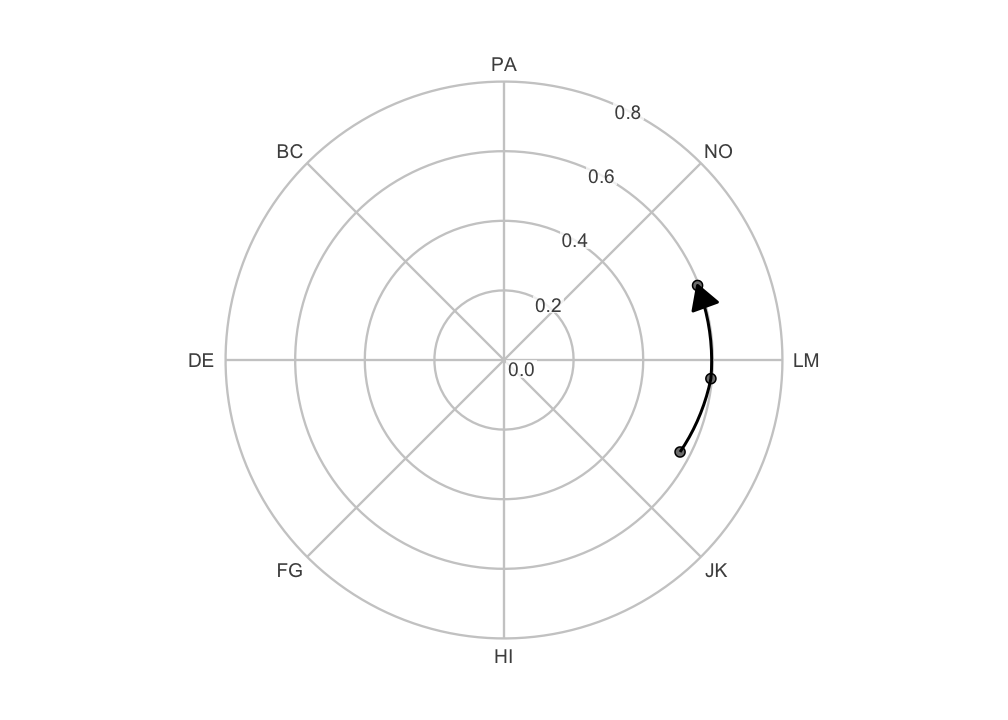
The arrowhead marks the direction of time. Note what the layer does
at the boundary. The estimated profile moves from about 332 to 355 to 21
degrees. The step from the second to the third wave is drawn as the
short arc of about 26 degrees across the 0/360 pole. It is not drawn as
a sweep of about 334 degrees the long way round. The path is curved
because coord_circumplex() munches each segment along the
polar geodesic: it splits the segment into short pieces that bend with
the circle. The layer supplies the ordering, not the drawing.
Occasions are connected in the order the rows appear in the data,
exactly as geom_path() does. Mapping group
draws one path per series. When you assemble a data frame by hand, sort
it into time order first. For the reason noted above, sorting occasion
labels as text puts T10 before T2 and silently
reverses time. ssm_plot_circle(), shown next, does that
sorting for you.
The same figure is available ready-made from
ssm_plot_circle(), which adds the path to its usual points
and confidence wedges:
ssm_plot_circle(results_long, path = TRUE)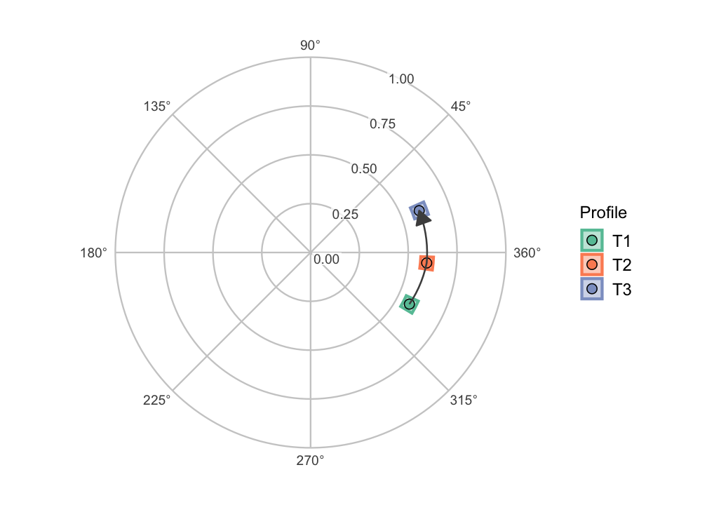
An occasion whose displacement is undefined (a flat or zero-amplitude profile) breaks the path rather than being interpolated through. The segment after the gap is still drawn on the correct branch. A path that skipped such an occasion would draw a movement that never happened.
9. The angle axis for linear plots
Not every circumplex figure is circular. The score-by-angle curve
drawn by ssm_plot_curve() is a linear plot whose x-axis
runs through the scale angles. scale_x_circumplex() labels
that axis consistently with the circular canvas: by default with the
angle in degrees, or with custom labels or an instrument’s
abbreviations.
The example below draws a made-up profile at the octant angles:
angles <- octants()The data frame curve has one row per angle in
angles, in its angle column. Its
score column follows a cosine curve with elevation 1,
amplitude 0.8 and displacement 135 degrees. (The code that builds
curve is omitted.)
ggplot(curve, aes(x = angle, y = score)) +
  geom_line() +
  geom_point(size = 2) +
  scale_x_circumplex(angles, labels = PANO()) +
  labs(x = "Scale", y = "Score") +
  theme_bw()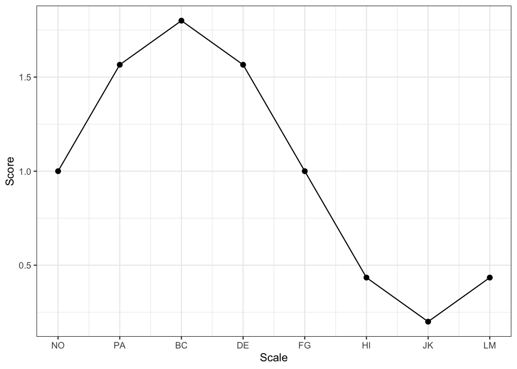
Pass the same labels (or the same
instrument) to both ggcircumplex() and
scale_x_circumplex(). This guarantees that a circular
figure and a linear one label their scales identically.
10. Relationship to the built-in plots
The built-in plotting functions are implemented on exactly these
components: ssm_plot_circle() is
ggcircumplex() plus geom_ssm_arc() and
geom_ssm_point(). It also moves the amplitude axis to a gap
that holds no point. ssm_plot_curve() uses
scale_x_circumplex() for its angle axis. So you can always
start from a built-in plot and add to it, or rebuild it from the pieces
when you need finer control. Whichever route you take, the coordinates
are computed the same way, so the results line up. Only the amplitude
axis can differ: to put it where ssm_plot_circle() puts it,
pass r_axis_angle to coord_circumplex(), as in
the path figure above.
Wrap-up
Every built-in circumplex figure is a composition of the same parts.
ggcircumplex() or coord_circumplex() draws the
canvas, and geom_ssm_point() and
geom_ssm_arc() draw the profiles.
scale_x_circumplex() labels a linear angle axis, and
theme_circumplex() styles the canvas. Start from a built-in
plot and add to it, or rebuild it from the pieces. No page follows this
one. To estimate how a profile moves across waves before you draw it,
read “Growth Models on SSM Parameters”.
References
Browne, M. W. (1992). Circumplex models for correlation matrices. Psychometrika, 57(4), 469–497.
Nagy, G., Etzel, J. M., & Lüdtke, O. (2019). Integrating covariates into circumplex structures: An extension procedure for Browne’s circular stochastic process model. Multivariate Behavioral Research, 54(3), 404–428.
Wright, A. G. C., Pincus, A. L., Conroy, D. E., & Hilsenroth, M. J. (2009). Integrating methods to optimize circumplex description and comparison of groups. Journal of Personality Assessment, 91(4), 311–322.
Zimmermann, J., & Wright, A. G. C. (2017). Beyond description in interpersonal construct validation: Methodological advances in the circumplex Structural Summary Approach. Assessment, 24(1), 3–23.